Adobe is what you call a mega site.
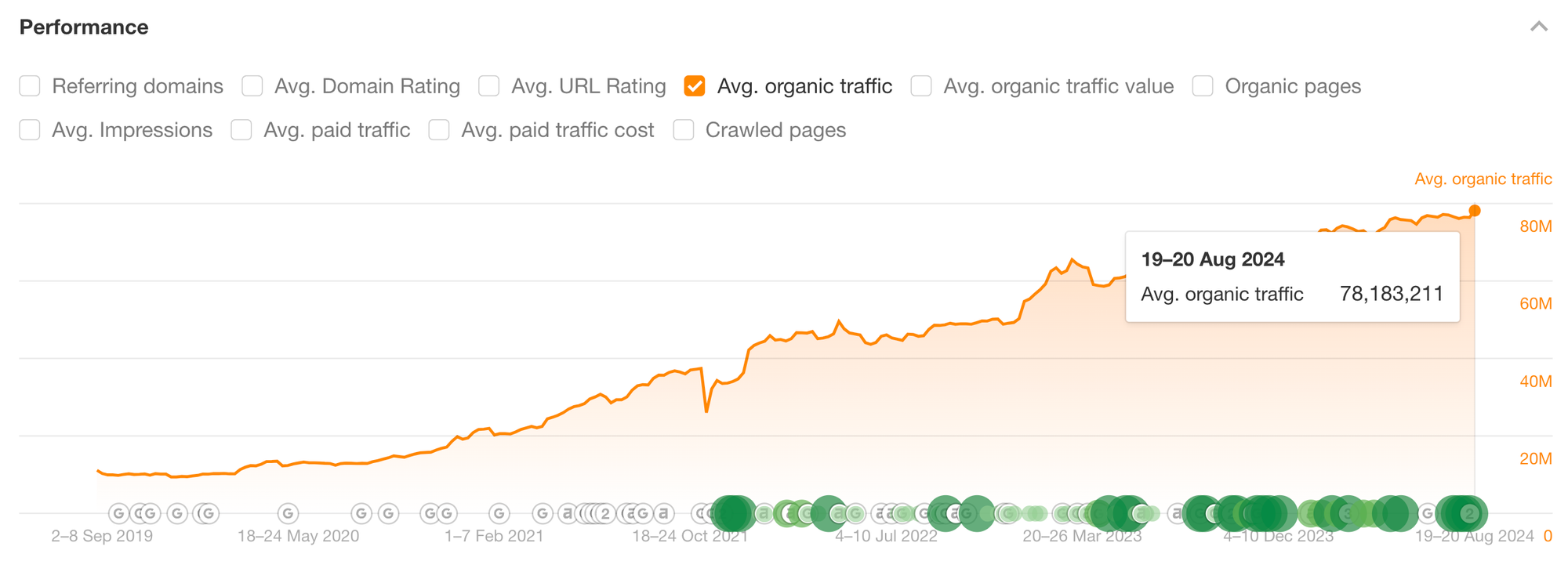
80M in monthly traffic according to Ahrefs and I think the internet is mostly better for it.
As I discovered when doing a competitor analysis for a client recently, their content quality is often beyond great—featuring high-quality images, useful tools, custom experiences, and expert opinions.
As a design company with what I can only imagine is a HUGE budget for SEO, analyzing how they build their site is like jumping through years of experimentation work.
So, let's dive in.
Three things I love about Adobe's SEO and blog design
These three things come from the product, Adobe Express.
1. Commercially aligned content, with built-in CTAs.
The keyword "infographic examples" is highly desirable—it has 60K+ monthly search volume and is fiercely competed over by sites like Canva, Piktochart, and Hubspot.
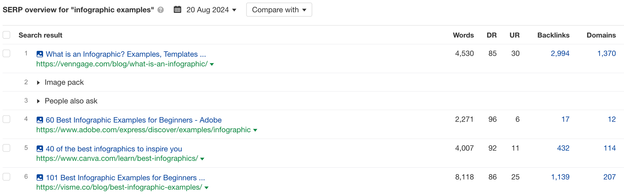
Adobe ranks #2 for it which, for Adobe, makes a lot of commercial sense. For many product verticals, key terms containing the word "examples" are likely top-of-funnel fluff pieces. For Adobe's software, Adobe Express—an online design tool and infographic maker, searchers of this term are surprisingly high intent.
A core part of Adobe's product is their customizable infographic templates, which make it easy for newbie designers to get started with great designs. The keyword "infographic examples" therefore allows Adobe to authentically showcase the product and push the reader to "start editing this template now".
The barriers between browsing infographic examples and signing up for the product is as low as one click.
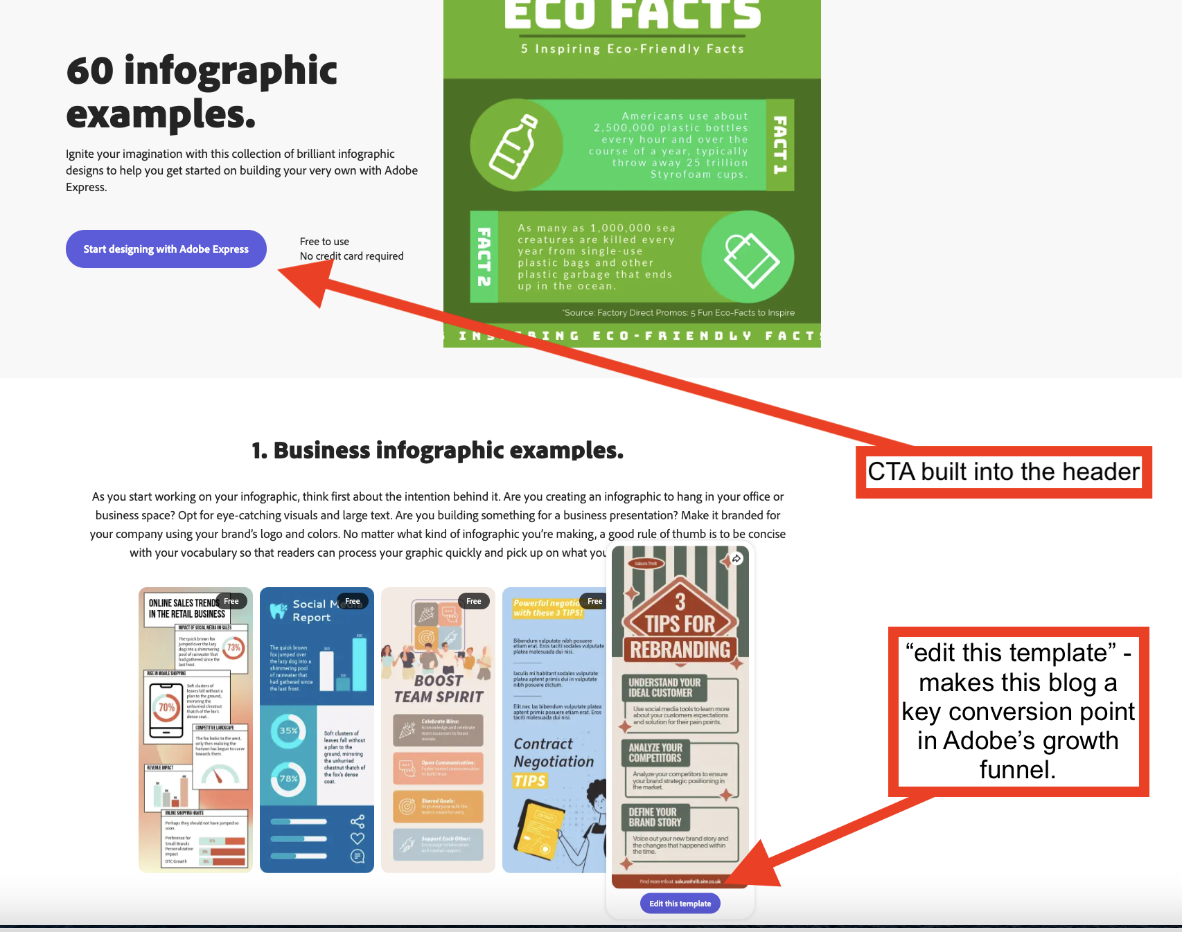
You can see that Adobe has built a custom page template for this keyword. It's designed to include a CTA at the very top and the content is an embeddable widget that showcases their infographics.
2. They use page design to improve the user experience AND meet search intent.
Something that really impresses me about the Adobe page shared above is how they chose to meet search intent.
The intent behind the keyword is to browse through examples in order to understand what they are and get inspiration.
The best way to meet that intent? Volume and variety. Blogs that win this SERP must include lots of examples.
Why? Because lots of examples allow the reader to:
(1) formulate their own idea of what an infographic is
(2) identify infographics that suit their taste, something for everyone
(3) draw inspiration from a multitude of sources
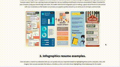
So, what did Adobe do that was special?
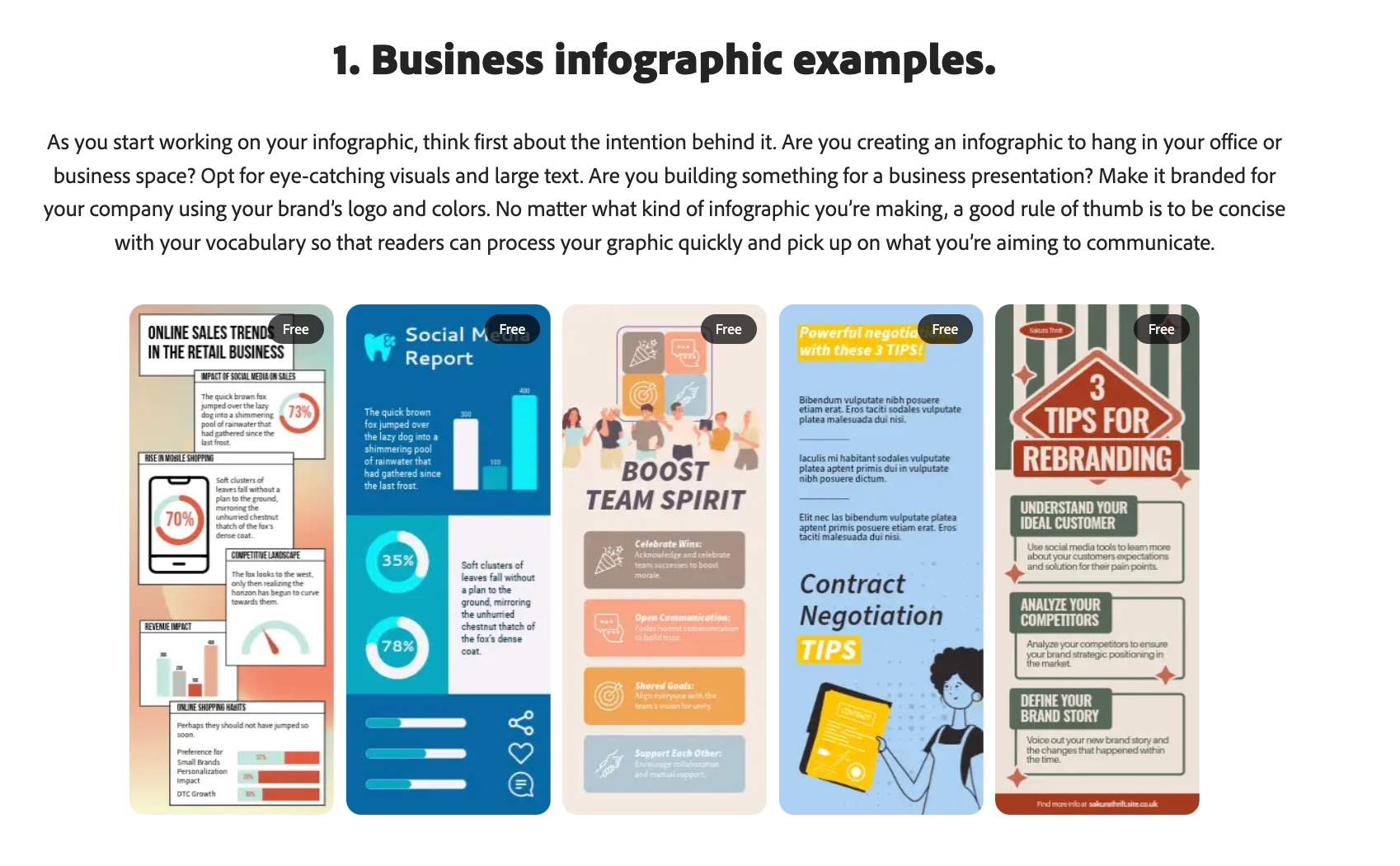
They stacked their infographic examples side by side within categories, fully zoomed out. This makes them more skimmable, makes it easy to showcase lots of examples in a short space of time.
What did everyone else do?
Most of the other SERP winners (including Canva, Hubspot, Visme, Semrush) all chose to list infographic examples one after the other like this:
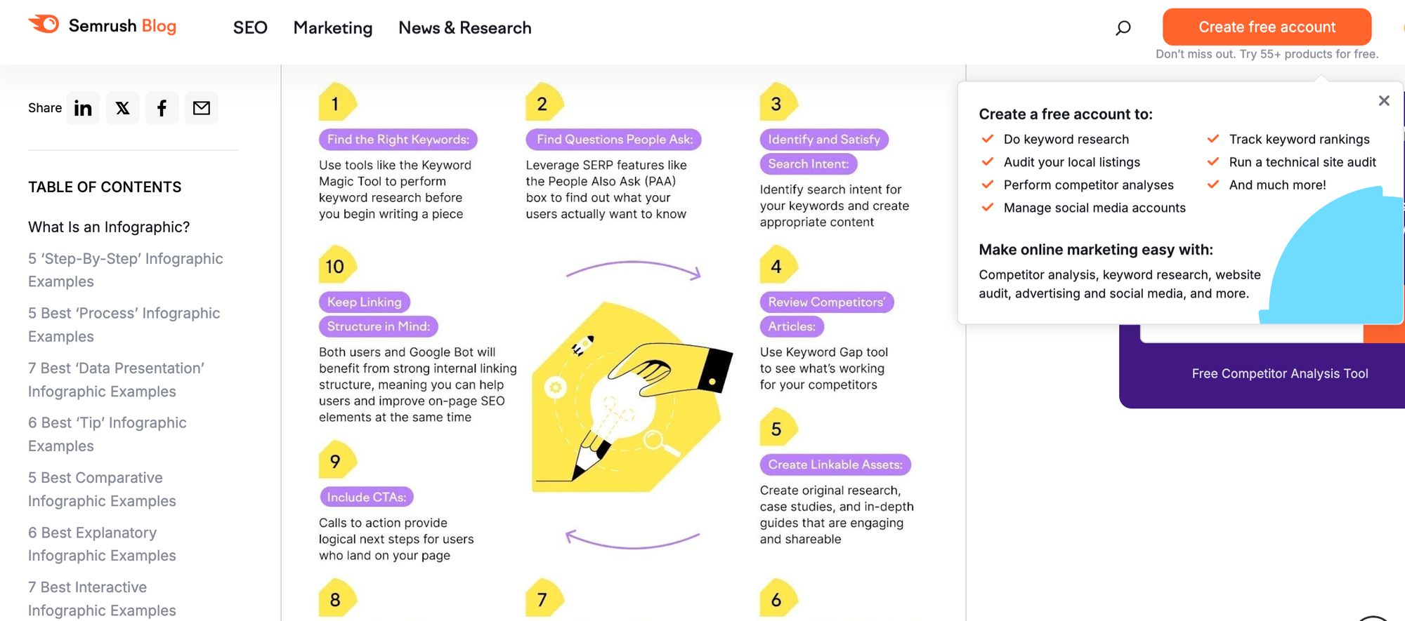
This is a poor experience in my opinion. You can't even see one infographic as they're typically so long they don't fit the page.
And it takes a surprising amount of mental load to scroll through 50+ infographics, many of which likely don't even fit on the page. So what do readers probably do instead? I'd guess they do what I did: scroll the first 5 and bounce.
Just check out Adobe vs Semrush's experience to make this even more obvious (sorry guys!):
Semrush
You see three infographics in 10 seconds.
Adobe
You see 60 infographics in 10 seconds.
This is how you build a superior experience that delivers on search intent better than anyone else—a huge win for collaboration between their devs, designers, and SEOs.
3. Their blog feels so skimmable—the zoom level is just Chef's Kiss
Another thing that made me envy Adobe's design prowess was something seemingly simple: the level of zoom on their blog.
When at page zoom 100%, this is what their body copy looks like:
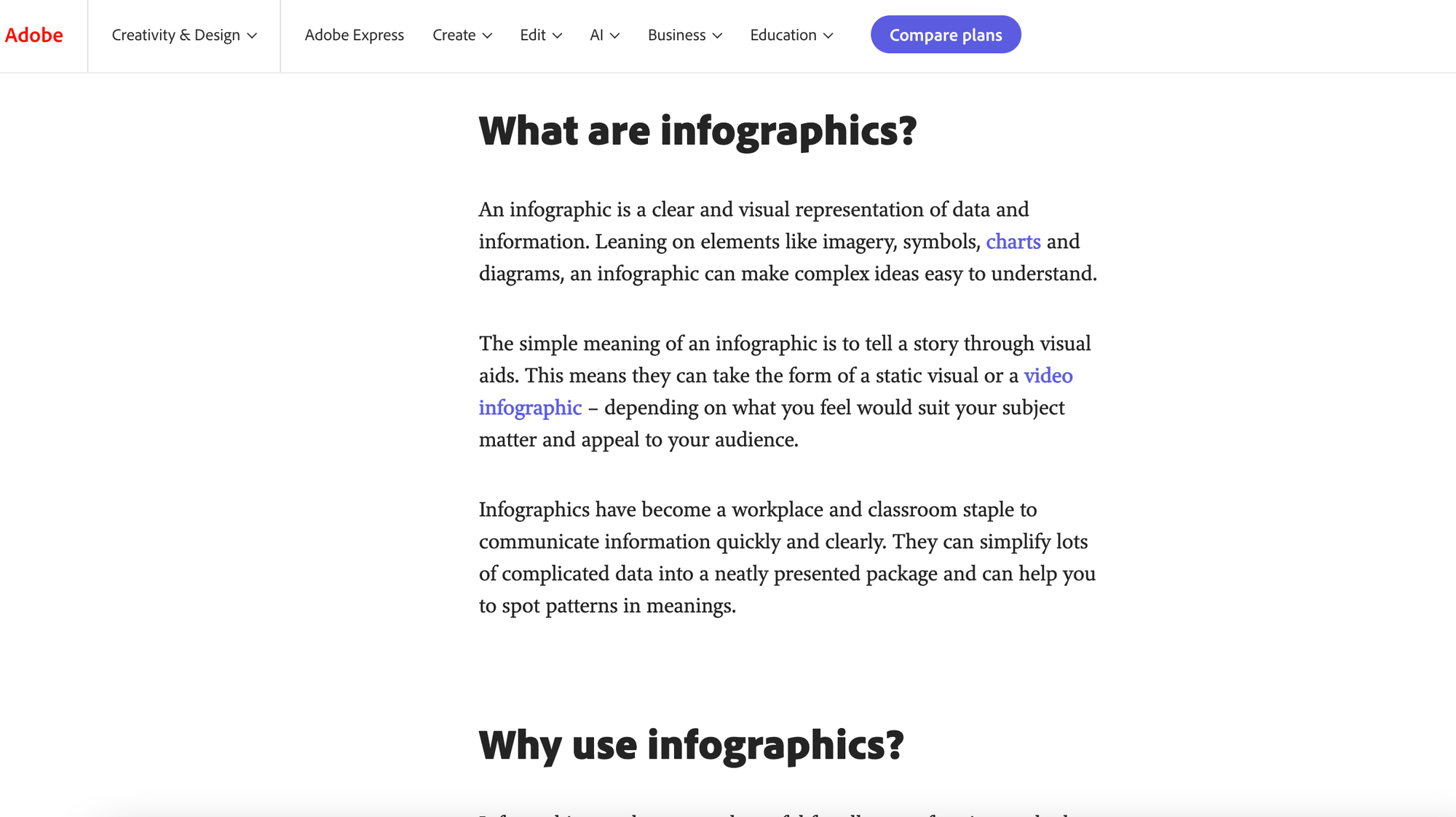
It doesn't seem like much, but check it out for yourself here.
It's just so skimmable. You can see so much in the frame of the browser without scrolling, which makes scrolling so easy.
Compare Adobe (left) to Hubspot (right):
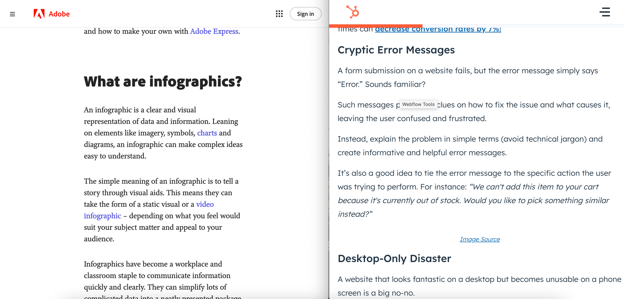
There's more white space. Paragraphs are shorter. It's more scrollable and less overwhelming to the reader.
Time to buddy up with your designers?
—Benny
Relevant reads: